


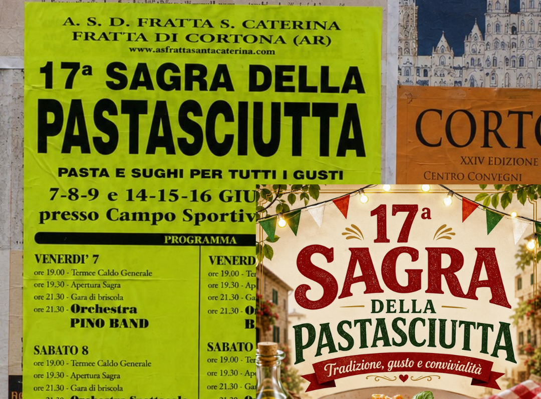
Since 2022, the Instagram account Sagre Brutte has been collecting posters from Italian village festivals under a slogan that immediately captures its good-natured ambivalence: ugly posters, beautiful festivals. It is a very funny archive of vernacular graphic design, with its unlikely typefaces, fluorescent backgrounds, photographs of tagliatelle cut out rather badly, and logos scattered around at random. Last July, Il Post reported that the archive had run into a problem its curators had not anticipated: a growing share of these posters is now generated using artificial intelligence models, and the opinion of those who have spent years cataloguing them is that the old ones, however badly made, were better. The administrator of the page describes herself as being forced to defend what she has spent four years mocking, explaining that the generated posters all seem the same to her, indistinguishable from one town to another, free of mistakes and therefore free of soul.
This analysis, entirely legitimate as a subjective judgment and in any case very widespread, especially among people who dislike AI, strikes me as revealing a recurring kind of aesthetic short-sightedness that I would like to try to examine.
Anyone who has looked at village festival posters from before 2022 knows that they were already, in some sense, “all the same.” In the case of those, in my opinion the most beautiful, made mostly of text, huge numbers and fluorescent backgrounds, the template was literally identical: only the choice of fonts changed, usually several of them and none particularly attractive, along with, obviously, the text and dates. Even in the others, which I would classify under the aesthetics of “1990s–2000s computer graphics” or “bad Photoshop,” variations occurred within a fairly narrow repertoire. After all, what amused us was precisely their shared bad taste, rather like the covers of Harlequin romances or circus posters. Variations on the theme of kitsch.
To be clear, it is harmless fun, but also slightly snobbish, and it is worth acknowledging this, because it assumes that one’s own eye is better educated than that of whoever produced the image, with or without AI. Having “more educated” taste, however difficult the term may be to define, is the product of many different paths, but those paths often include an element of social and class privilege, because education costs money. I am not condemning anyone, and I include myself in this small criticism, since I have never held back from laughing at “ugly” graphics I encounter. Still, it is worth pointing out.
Returning to festival posters, what has changed is our position in relation to uniformity. We have spent twenty years familiarising ourselves with the vernacular of the local copy shop and only a few years with the constantly changing vernacular of image generators, and in the latter we are less able to perceive internal differences. Social psychology calls this asymmetry the outgroup homogeneity effect: the impression that members of a group with which we are less familiar resemble one another far more than they actually do. It applies to faces and, to some extent, accents, and I would argue it works just as well with images. When someone says that generated images are all identical, for the most part they are describing their own incomplete education in the medium. I work with these tools and can distinguish various differences without effort, just as a printer can distinguish offset printing from laser printing, not because of any special perceptiveness, but simply because of habit.
“The black background, large lettering with a brushstroke effect and the glossy appearance typical of automatically generated images, as well as a general sense of order and alignment among the elements,” which Il Post identifies as hallmarks of AI, are, besides being only some of AI’s many hallmarks, a template not particularly different in its rigidity from the Microsoft Publisher clip art of a few years ago. In both cases, someone without graphic-design training accepts a set of options preconfigured by an infrastructure.
The most substantial difference concerns mistakes. Those who defend the old posters appreciate the badly chosen typeface, the crooked logo, the poorly cut-out photograph, all the traces revealing that there was someone behind the work who did not really know what they were doing. It becomes clear, then, why generated posters are irritating even when they operate within the same kitsch repertoire: the clichés are more or less identical, but what the model removes is technical incompetence. They are ugly posters, but they are made as though they had been executed by a technically competent graphic designer. Why should that bother us so much? If someone without much money can get a technically less ramshackle result, good for them, no? Perhaps that subtle snobbery mentioned earlier has something to do with it.
Either way, the ugliness of the past does not disappear. On the contrary, it becomes almost chic. Among professionals, in fact, deliberately reproducing ugliness by hand is fashionable, although anyone who knows how to use them can achieve much the same result quite easily with a generative model.
In 2025, Too Good To Go organised a leftovers festival with a fluorescent poster built around village-festival aesthetics, and at this year’s Design Week, Dropcity did the same with a party whose name and graphics openly referenced the genre. When professional designers begin quoting popular graphic design, that graphic design has already stopped being popular. It is the usual trajectory of every mass visual language: Comic Sans, WordArt, the fluorescent rave flyer, early-2000s web pages with animated GIFs and tiled backgrounds. First mocked, then archived, then quoted, and finally brought back into circulation at a higher price.
In fact, I would bet that in a few years somebody will complain about the disappearance of the brainrot of the old days. Those absurd creatures with mock-Italian names that have spread among teenagers around the world are among the first original mass aesthetics of the generative era, and they have all the characteristics of the vernacular. Anonymous production, minimal effort, indifference to any professional standard, infinite variations based on a handful of patterns, horizontal circulation, no signature, a shared vocabulary developed from below. Nobody is defending them yet, but when they reach our age, our children will miss them while complaining about some other infernal invention of their own present.
The same automatic aesthetic reflex appears in advertising, where I increasingly encounter generated material. Many of these ads replace campaigns that I already found equally ugly and often identical in structure: ads for dentists, detergents, supermarkets, all had their established repertoire. They were what I would call “stock-photo advertising.”
What generation adds is merely a residue of unreality caused by realism that is not yet perfect. This is, however, a technical limitation destined to disappear, and one that many viewers, often those over forty, do not perceive at all. Here too I would bet that in the future our children will look at it with the same nostalgia with which my generation looks at the grain of 1990s film.
The village festival poster is rooted somewhere. It points to a place and a community, and that is why its replacement becomes news. A mattress commercial does not. That type of communication was already banal, though not grotesquely unprofessional. Criticising such advertisements for being uglier than they used to be would make little sense, and in most cases we do not even notice that the transition has taken place. In theory, what also makes it “visible” is a new law. Since 2 August this year, Article 50 of the AI Act, the European Union’s artificial intelligence regulation, has applied, requiring machine-generated or manipulated content to be labelled. The obligation does not cover every artificial image, but it does cover deepfakes, meaning material that plausibly depicts people or events; openly stylised illustrations remain outside its scope. Advertising populated by generated people clearly falls within it, which is why tiny notices have begun appearing in the corners of commercials over the past few weeks. Pay attention, because they are almost invisible.
I find this measure largely pointless, for reasons similar to cookie notices. When it comes to a deepfake depicting a real person, disclosure makes sense, and I am happy to defend it. In a mattress advertisement, where in the end everything was fake before as well, let us remember that actors are acting, the label serves no real purpose.
Meanwhile, the market is embracing these tools mainly to save money, when the only truly interesting reason to use them would be to do things that could not be done before. The result disappoints those who used to work without models, because they lose commissions, and it also frustrates those who work with models, because they are asked to reproduce the exact same product as before at a lower cost instead of experimenting with something new.
The taboo, moreover, contributes to aesthetic flattening. If admitting that you used a model exposes you to public ridicule, the most rational use becomes a mimetic one: imitating as closely as possible what was done before so that nobody notices. If the taboo disappeared, or rather, when it disappears, I believe we would also see some interesting experimentation in the commercial sphere.
So, is there such a thing as a kind of ugliness specific to AI? Yes and no.
I have argued elsewhere that mediocrity accompanies every expressive medium once it becomes accessible, from oil painting to photography, and I will not repeat the examples here. Presenting as something new a phenomenon that is not new at all strikes me as absurd. Just think of the enormous quantity of photographs we pour onto social media, very few of which possess any particular aesthetic value. Human history has never been a story of the continuous production of masterpieces, but rather one of abundant mediocrity. We prefer telling ourselves that the machine is to blame, but no: it is still us. We are the mediocre creatives, and that is normal, because not everyone is an artist.
What interests me here, however, is the rhetorical function of the term. “Slop” makes sense if it names something specific; when it is used to describe everything produced with a particular tool, it becomes a useless generalisation.
In the column of things that already existed before AI, I would place, for example, the use of templates and clichés, the repetition of fixed patterns, an abundance of kitsch, the accumulation of elements, risky colour choices and the absence of typographic hierarchy. These are categories nobody knows how to define precisely and yet we recognise them with a certain degree of agreement. All this stuff existed before and still exists now, often created by the very same people. And they are right to do it, if they do not have money.
In the column of genuinely new things, only one item remains: technical competence. The model does not crop the image incorrectly, does not leave text outside the margins, does not enlarge a seventy-two-dpi photograph by four hundred per cent. The ugliness remains but loses the fingerprints of the person who produced it. Uniformity, however, does not belong on the list, because if you actually look closely at generated posters or advertisements, they do not resemble one another any more than their predecessors did, provided you know how to look at them without the prejudice that assumes in advance that they are identical.
The picture is further complicated by experimental evidence on bias. Last May, an artist who goes by the name SHL0MS published a detail from one of Monet’s Water Lilies, passed it off as an AI-generated image and asked for opinions, collecting a remarkable assortment of elaborate negative critiques before revealing the trick. Several studies support the anecdote. Research by Kobe Millet and colleagues on anthropocentric bias in the appreciation of AI-generated art shows that we tend to “defend the species,” granting human works a credit we deny to algorithmic ones even when we cannot actually tell them apart. A study by Horton, White and Iyengar finds that prejudice against AI-produced art can even increase perceptions of human creativity. The same happens with writing, and recent research by Raj, Berg and Seamans documents a consistent penalty applied to texts labelled as AI-generated. Part of the reaction to village festival posters, then, concerns the label more than the content, and people who claim they can always recognise an artificial image regularly overestimate their own ability.
Models are chosen to spend less and work faster. The Il Post article notes that in many cases festival organisers used to rely on relatives or friends willing to work for very little or for free, meaning that at the scale of a village festival the amount of paid work being displaced is close to zero and the economic objection does not hold up particularly well. Especially because the people using AI may well be exactly the same people as before. With Coca-Cola the argument has more force, and indeed in that case criticism is framed in terms of commissions being taken away from agencies and professionals. The principle worth defending is that anyone who works on an image should be paid, with or without AI. What I see happening, though, is something else: companies use these tools to reduce the cost of what they were already doing instead of raising the quality or ambition of what they offer, and shrinking budgets risk hurting everyone, including those who work with AI.
It should also be said that a great deal of AI-assisted work is invisible, often well paid, almost never entirely automated, and kept hidden by the very people doing it. Retouching, background-element generation, frame extensions, storyboards, moodboards, variations, corrections, references: all things that have entered professional workflows over the past couple of years and that almost nobody declares, for the reputational reasons mentioned above. Trying to draw a clear line between those who use these tools and those who do not is a pointless exercise.
Someone generating a festival poster with a model is, after all, still working. Whether they are working badly or well depends on the result. What is missing, in my view, is solidarity between those who work with these tools and those who work without them, because wars among the poor never benefit the poor. Aesthetic contempt fuels this division, and those with an interest in making sure neither side gets very much out of the situation are the ones who prosper from it.
I would therefore say: village-festival graphic designers of the world, unite.
Francesco D’Isa